The Pet Sitters Cape Town homepage was in need of some love, so I gave it a complete facelift.
This case study highlights how the redesign aligns with best practices for modern pet-care websites:
With a few refinements especially around visuals, mobile-friendliness, and navigation simplification the website now better supports conversions, builds trust, and strengthens brand differentiation.
The Pet Sitters Cape Town website had not been refreshed in some time, and several known user challenges were starting to impact the customer experience.
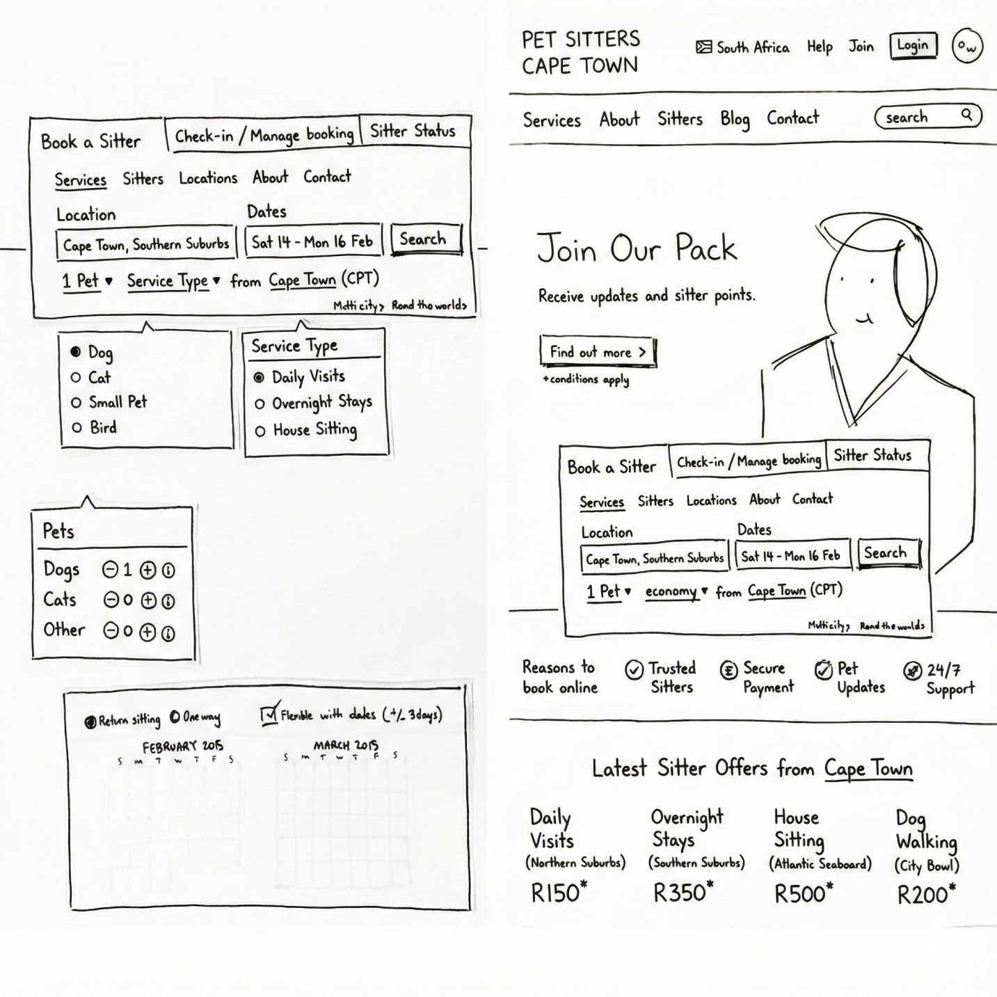
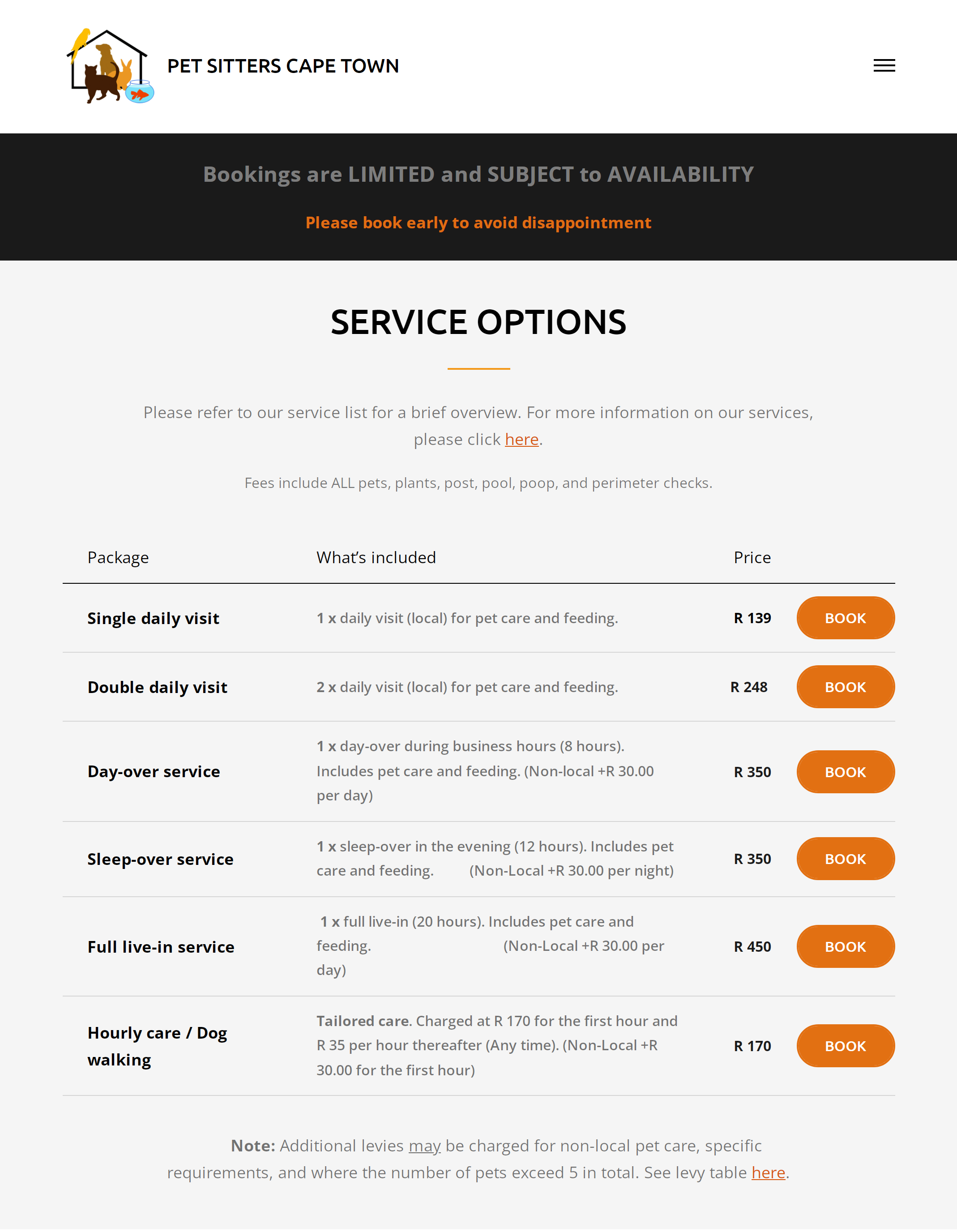
Our goal was to modernise the look and feel, clarify the service offering, and make it easier for pet owners to submit booking or service queries.
A key constraint was that the existing backend needed to remain intact, so all improvements had to be achieved through front-end restructuring, UX enhancements, and visual design updates.
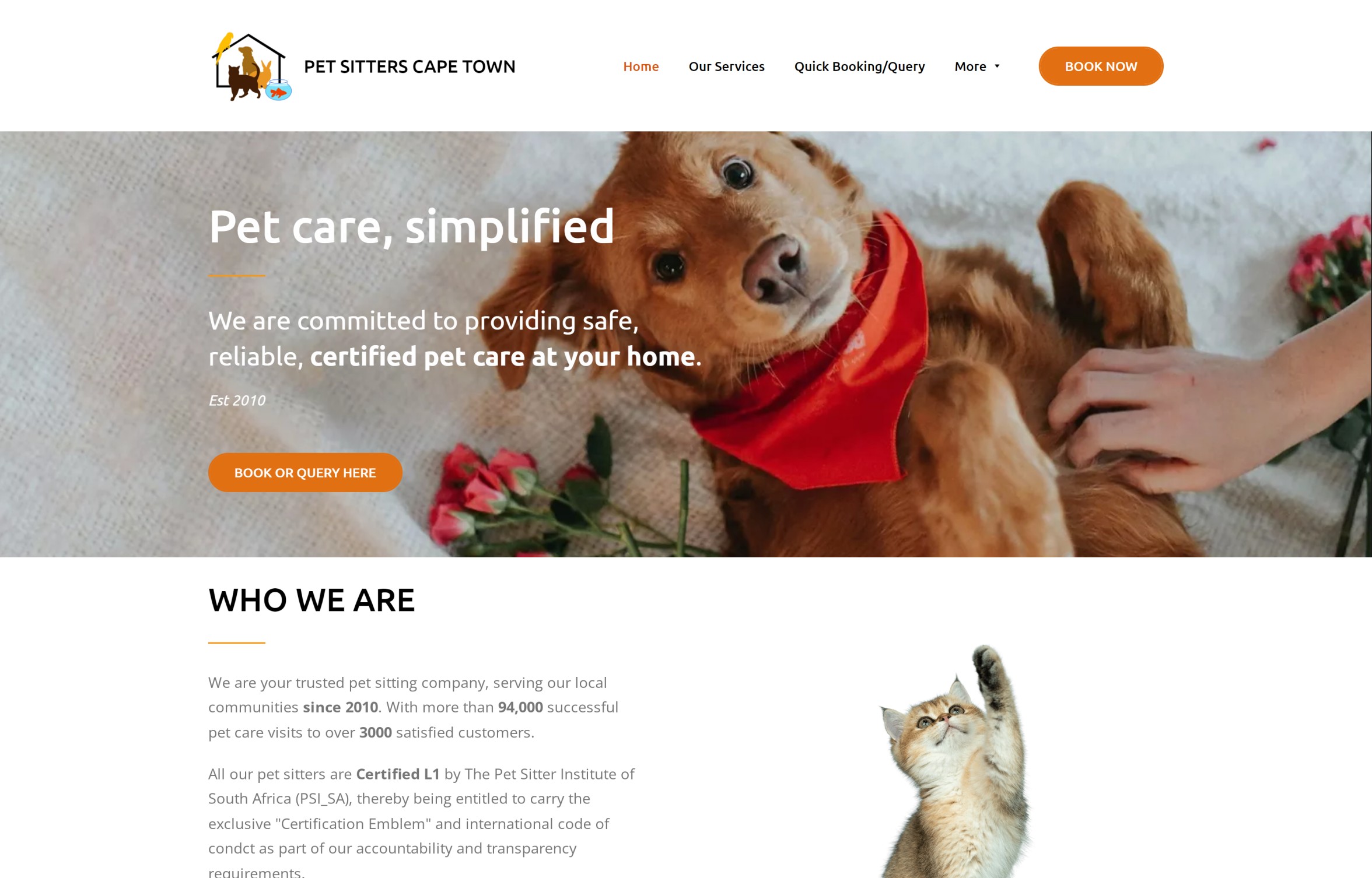
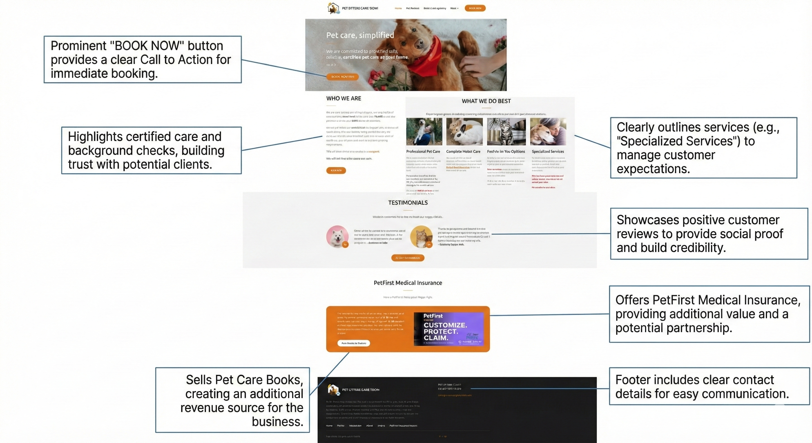
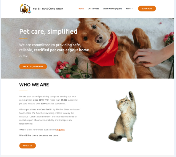
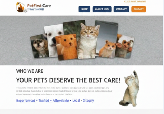
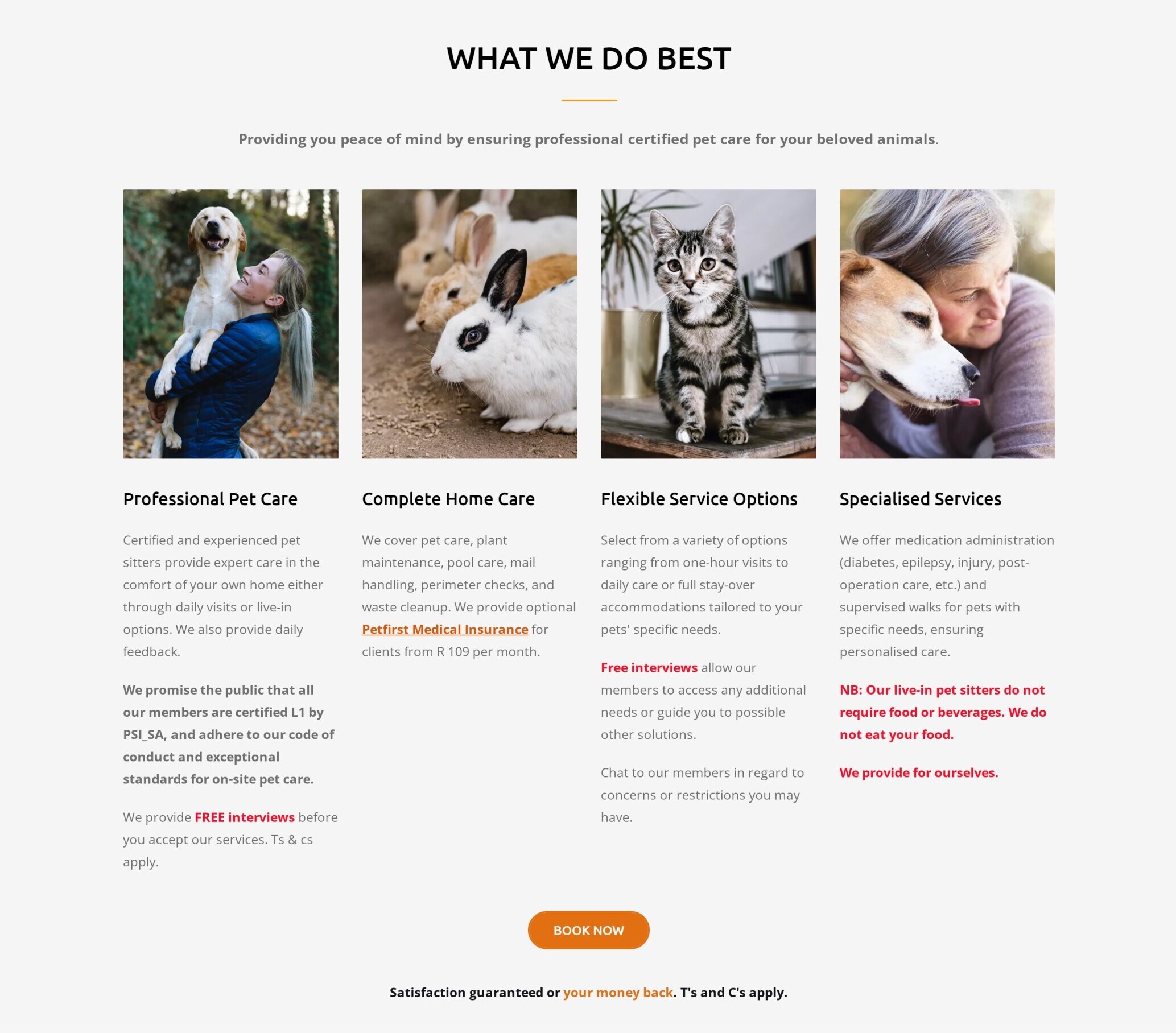
When reviewing the previous version of the homepage, it became clear that the design attempted to place as much as possible above the fold likely due to older marketing assumptions.
While it was impressive how much content was squeezed into the top section, it created a dense, cluttered layout with many competing elements. This made it difficult for new visitors to understand the services offered and how to book.
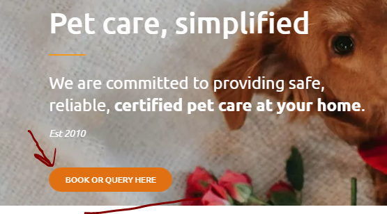
Using insights from user behaviour and client feedback, we redesigned the homepage to guide visitors through a clearer narrative:
Who we are → What we do → Why we’re trusted → How to book.
When I dream up a new interface, I love starting with paper—sketching out each component, cutting them free, and arranging them on a bigger page with Blu-Tack. It feels a bit like building a joyful UI jigsaw puzzle(as seen in above sketch).
This playful approach makes it easy to shift pieces around, explore new ideas, and refine parts of the design without redrawing everything from scratch. Once the page’s layout takes shape, we dive into more detailed, lively sketches of each module.
I’ll go through the basic thought process behind each module design separately below.
Pet Sitters Cape Town is an established home-based pet-care service with thousands of successful visits and a strong reputation in the Cape Town area. Although the business had grown significantly over the years, its website had not kept pace. As a result, several user-experience issues were beginning to impact customer understanding, trust clarity, and conversion rates.
My objective was to modernise the website, improve how services were communicated, and create a simpler, more intuitive path for pet owners to make enquiries or bookings all while working within the constraints of the existing backend system.
Before the redesign, the homepage attempted to present nearly all information above the fold. This was likely driven by older marketing assumptions that users would not scroll, leading to a dense, visually heavy layout.
While it was impressive how much content had been packed into one screen, this approach introduced several issues:
Analytics, enquiry data, and customer feedback revealed that users needed a more structured and calming introduction something that built trust gradually instead of presenting everything at once.
Pet owners should immediately understand who the business is, what services are provided, and how these services address real needs such as pet comfort, convenience, home safety, and affordability.
Certifications, years of experience, number of completed visits, and strong testimonials needed more strategic placement to support credibility.
The “Book or Query” button required greater visibility, improved positioning, and a more supportive explanation of what users can expect after clicking.
Because a backend rebuild was not in scope, improvements were achieved through thoughtful restructuring, UI enhancements, and visual updates on the front end.
Instead of overwhelming visitors with everything at once, the new design guides users along a logical path: Hero → Services → Benefits → Trust → Testimonials → Additional Offerings → Booking.
Service categories were reorganised into clear, scannable cards for daily visits, live-in care, home-care services, and specialised pet care. This helps users quickly identify what fits their needs.
Certification badges, experience metrics, and genuine testimonials were elevated higher on the page to better support first-time visitors.
The primary call-to-action,“Book or Query Here,” was made more prominent and repeated throughout the page to support decision-making at every step.
Since the business revolves around pet care, the content needed to feel warm, reliable, and highly organized, reassuring pet owners that their pets would be in safe hands.
I structured this section into four key service cards: Professional Pet Care, Complete Home Care, Flexible Service Options, and Specialised Services.
The layout uses a balanced grid system supported by large, emotive pet images on top of each card. This creates immediate visual trust and helps users connect emotionally.
Typography is used to establish clear hierarchy:
A strong and visible “Book Now” button is placed centrally to encourage conversions, followed by a confidence-building reassurance statement: “Satisfaction guaranteed or your money back.”
The redesigned website delivers a cleaner, more trustworthy, and more engaging experience for both new and returning pet owners.
Overall, the site now reflects the professionalism and warmth that define Pet Sitters Cape Town’s brand.
This project shows how a thoughtfully redesigned front end can significantly improve user experience without altering backend systems. By reorganising information, highlighting trust elements, and guiding visitors through a clear narrative, the website now functions as a far more effective digital touchpoint helping both users and the business achieve better outcomes.
The new design was put to the test against the original via an A/B experiment, and the results exceeded our expectations, showing superior performance in critical areas. Working within the tight technical scope presented a fun and valuable challenge. This project serves as a compelling case study on how even strictly visual modifications can dramatically improve the user experience and significantly boost a homepage's conversion rate.